In 2009, we were rising out of the Great Recession. The pervasiveness of the Apple iPhone, and to a lesser degree at the time Android devices, were creating a new Gold Rush in San Francisco. A colleague of mine, Sima Sistani, and I were TV addicts. We felt that TV was inherently social and that people had computers or mobile in their hands while they are watching. We saw an opportunity to work with media companies to capitalize on these upcoming trends. We were working for a small development company and seeing the potential for growth in the mobile space but our company was pivoting to building bespoke advertising campaigns on Facebook. We felt like this was a missed opportunity. So, we started meeting in the evenings with calendar invites for Michael Scott Paper Company, a reference to the fifth season of the television series The Office, in it Michael Scott & Pam Beasley form their new paper company together. We landed on an idea and named our new company ROGUE PAPER. Paper as a nod to The Michael Scott Paper Company and mobile, as paper gone rogue.
IMPORTANT CONTEXT
The tech landscape in 2009 was quite different. The original iPhone and iPhone 3G were in the market running iOS3, with iPhone 4 and iOS4 following that summer. Facebook had just introduced the ability to “Like” posts and finally inched past MySpace in users. Twitter was in its meteoric rise, but was only starting to adopt features like hashtags, had a reputation for crashing made infamous by the Fail Whale, and continued to limit tweets to 140 characters. Its power for television was just being understood in late 2010 when it was used for then President Obama to field questions at town halls. Foursquare, a location check-in app for letting people know where you are and collecting rewards, was blowing minds.
Ideation & Exploration
We initially thought we could become the Foursquare for media consumption, making it so that people could check-in to showes they were watching and find other fans who like it, too. As we explored the concept, we wondered what you would do once you go there and maybe made friends. We thought that there would be little left for users to do. But, we needed to learn form our users. So, we set out to watch people watching television to see whether technology could make them do what they already want to do with greater ease.
Personas
We developed personas for our target demographic. Personas gave us a general understanding of what groups our target users belong to and the behaviors we could match for our observations, cross-referenced to device usage, application adoption, age, and potential television watching behaviors. This also gave us our recruiting criteria.
In-situ Observations
Our hypothesis was that there was a market for a companion TV application for people to use while they were watching their favorite shows but we didn’t know what the hook would be. So, we conducted research with people in their homes watching TV alone or watching in groups to observe different behaviors while watching television.
SYNTHESIZING INSIGHTS
We extracted data to find patterns across participants to create insights. Our takeaways were that people talked to each other while they watched TV, often pausing to have longer conversations in groups or to text during a viewing. Our cohort was located in the SF Bay Area, so tech usage was high but we didn’t have any sessions where a device wasn’t in hand.
I don’t like to watch shows when they come out. I like to watch them later to skip ads. I can’t talk to my friends who have seen it because there’s nothing I hate more than spoilers!
Alejandra - Millennial Time-Shifter
I hate to watch TV alone. I want to talk to other people watching it while I’m watching it.
Whitney - Millennial Appointment Viewer
Me and my friends have a Skype going anytime we’re watching so that we can feel like we’re together.
Andrew - Millennial Live Sports Time Shifted Everything Else
I like to Google things while I’m watching. I sometimes have to watch a second time to pause and look up things I wanted to know.
Malena - GenX, Appointment Viewing + Binge Watcher
Refining Initial Idea
While were weren’t ready to completely give up the idea of a TV check-in app (akin to Foursquare for Media), we saw something powerful in conversations people were having around TV. Remember, at that time, Twitter had not yet become the defactro go-to for watching television. We were seeing conversations about TV programs happening in fractured places: blogs, Tumblr, media company websites, and Facebook. However, as a viewer of a program that was increasintly time-shifted or binge-watched, I didn’t have a destination. This led us to our next steps (1) test conversation and chat around programs to see if we could find some magicical moments with users, and (2) talk to media companies to better understand their pain points and explore whether this is a problem they wanted to solve together.
Fundraising & Hiring
The next phase of our journey was to raise money and recruit developers to join our mission. Startups were booming in San Francisco at the time. The boom was created in part by the mythos of startups created by Y Combinator, SV Angels, and the success of companies like Facebook who were encouraged to move west by their investors. The other factors were that mobile became an innovation platform that was generating money for small and large developers alike.
We were fortunate to make great connections and to find a development team in Bueños Aires Argentina who were ready-made for our mission – iOS savvy, experience with chat and technologies like ERLANG, and a price point we could afford with the small friends and family round we raised. We were lucky to work with an amazing design team who I met during my time in Sweden. They were based in Malmö, Sweden. These great resources with our investors and advisors helped us iterate through our ideas. We also assembled an amazing group of advisors and set out to build our product and our business.

Prototyping
We continued to believe that TV is inherently social, and conversation was the cornerstone of a successful co-viewing or second screen experience. Our initial prototypes had two goals:(1) understanding the optimal user experience, testing and iterating to serve users, (2) testing the concept with media companies. We had relationships with media companies and wanted to understand the problem space to see whether the business of working with media companies as partners for the shows with exclusive content was a more enticing path.
Customer Validation
We had a business idea that this platform would work well for media companies to help them monetize the conversations happening around their content, and to provide a destination for users to have a TV companion. So, with some user data and an early prototype of our platform, we set out to validate our idea with media companies.
User TEsting
From our research, we saw that conversations were the core of co-viewing. If could get that experience right for users, then we would have one pillar of our experience sorted. It started with chat and conversation on appointment television – at the premiere of a new show, for the latest epidsode of a hit TV show, Award shows, and live sports.
The empty room effect. Without great adoption, the conversations were limited and not that much different from a normal chat or text message chain with people who you know.
The TV environment was fragmented in terms of when and how people watched. For example, some viewers with like behavior profiles watched programs when they were live, others paused at the start to avoid commercials, and even more watched within the Live+3 window, or measured from first airing plus 3 days.
Communities can thrive around any TV program, however the best were less heady and more action-packed. The co-viewing conversations were well-suited for reality TV, live action events like sports, competition shows, and awards programs.
When bonus content was presented in the chat timed to the program, viewers in the chat engaged at higher rates with the chat for the remainder of the program.
Viewers of sports, awards shows, true crime, dramas with historical context, and documentaries engaged more when additional data was inserted into the chat, timed with the viewing.
Some demographics were extremely receptive to gamification and rewards for chatting and checking in to programs.
We synthesized our insights from user testing and matched it to the data from our test cohorts and continued to iterate through the user experience and product design. We identified new areas of continued research and built some of the features into our prototypes, ultimately iterating through to a beta product and finally our version 1 product.
TV Tune-In
01
Tune-In, A Check-In Feature
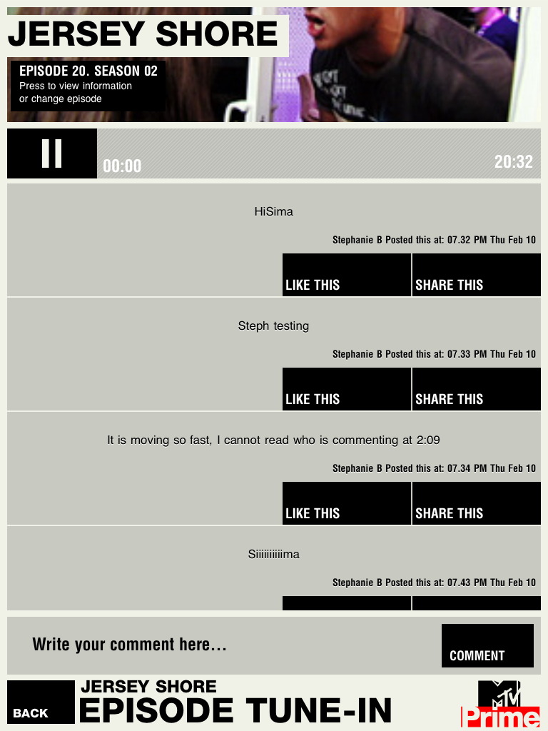
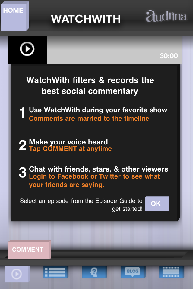
TV Tune-in’s unique check-in function allows users to indicate the start of the program so that we could approximate when in a program a user was viewing. We put the control of time-shifted viewing in the hands of the users, allowing them to control the timeline of the conversation via our unique fast forward or rewind timeline feature.
Knowing at what point viewers are in a program opens a lot of opportunities for engagement.
02
A Single Destination for Content
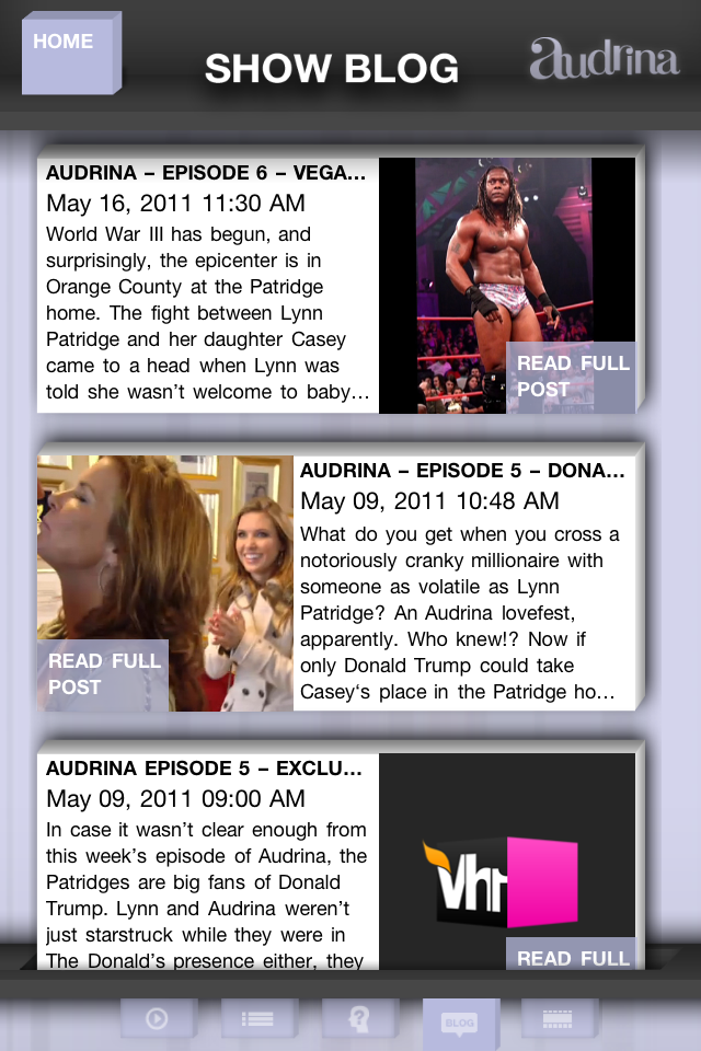
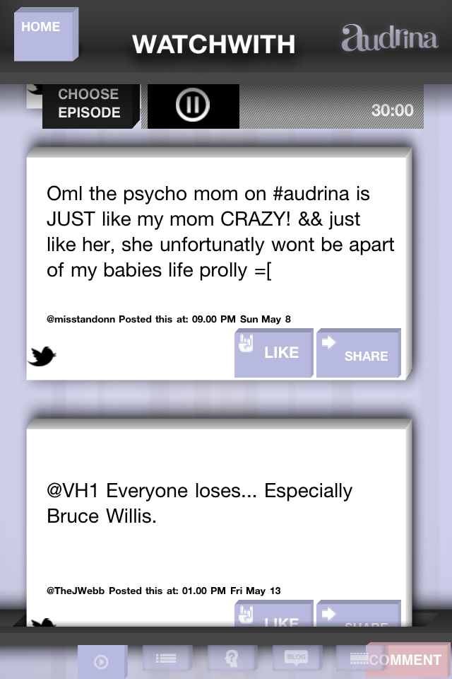
TV Tune-In aggregates social sphere chatter and timestamps it to the moment the comment happens during a show airing.
To deal with the empty room problem, particularly on first run of a program, we pull conversations happening about the program in Tweets, comments on Facebook, and in the blogosphere. This feature was a dial, it allowed us to adjust the level of imported comments versus organic, in-app comments based on the producer’s preferences.

03
Time-Shifting Conversations
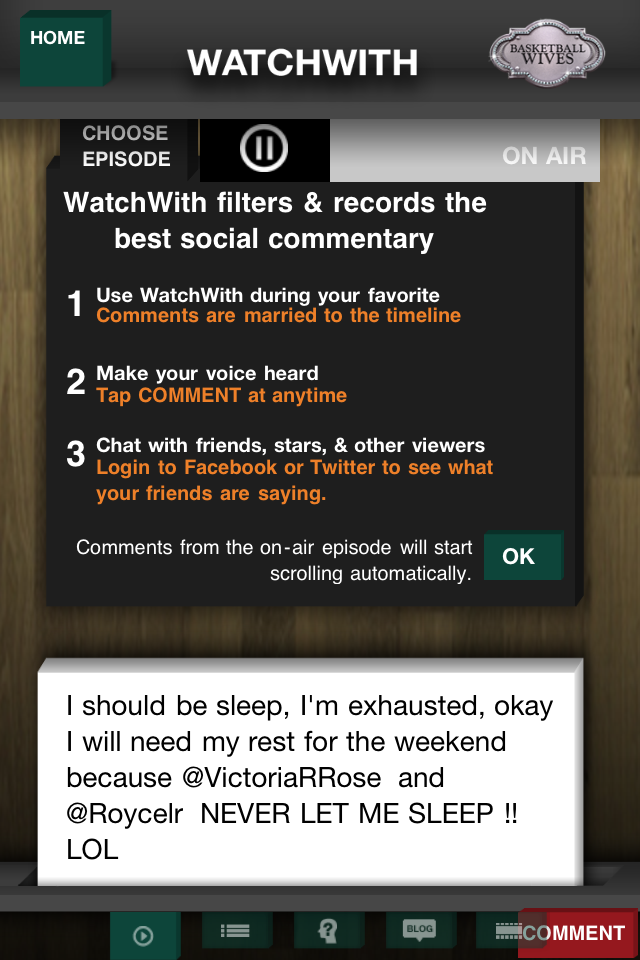
All comments were recorded on first run of a show. This allowed to further fill the rooms with people, interactivity and content. However, the killer feature here was that people could watch the programs time-shifted and see the conversations as they happened in real-time.
The water cooler moment is happening in-app real-time, and can be replayed for the time-shifted viewer.

04
Curation & Moderation
Social commentary, particularly for a popular show, can be a fire-hose of irrelevant chatter. The TV Tune-In stream is curated based on the users social graph and editorial content.
Comment quality is paramount in creating a curated TV companion experience. To ensure to best experience, we created a curation system that we would filter certain users and words in conjunction with a rating system for comments, and thus commenters.

05
Content Management System
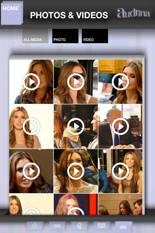
With users engaged in the second screen social stream, editorial content and contextual advertising can be pushed to a user, synchronized with the program.
Additionally, producers can push specific hashtags and popular comments (either organically, or editorially defined) to additionally populate back out to the social sphere. Not only does this allow to control the experience in-app, it also provides tools to influence the conversations back out into the social sphere.

06
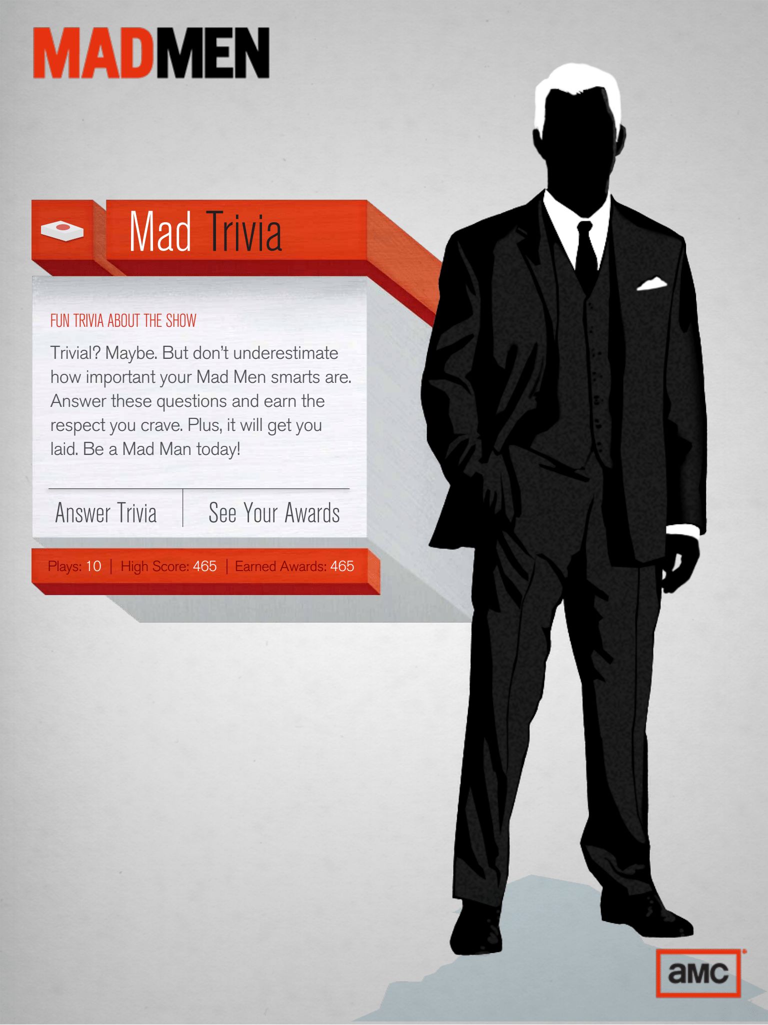
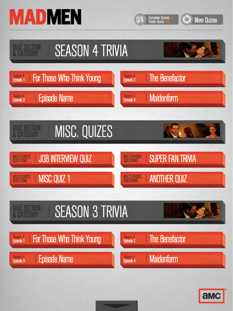
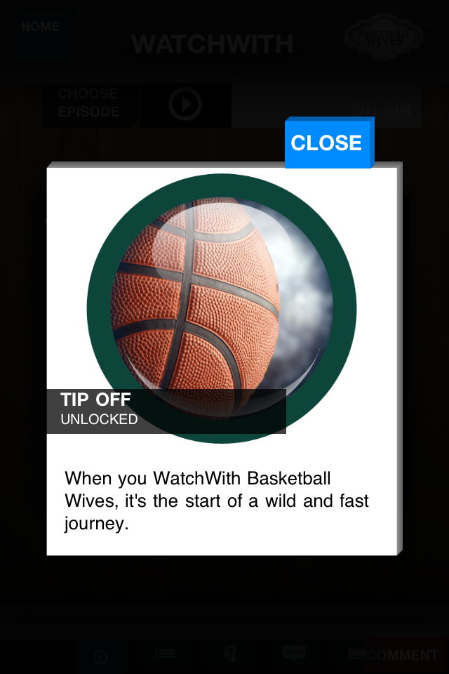
Achievements & Games
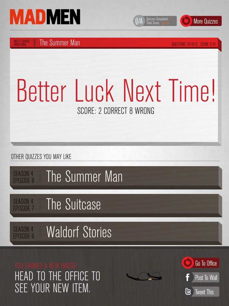
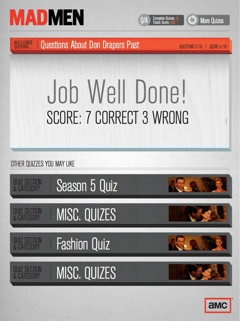
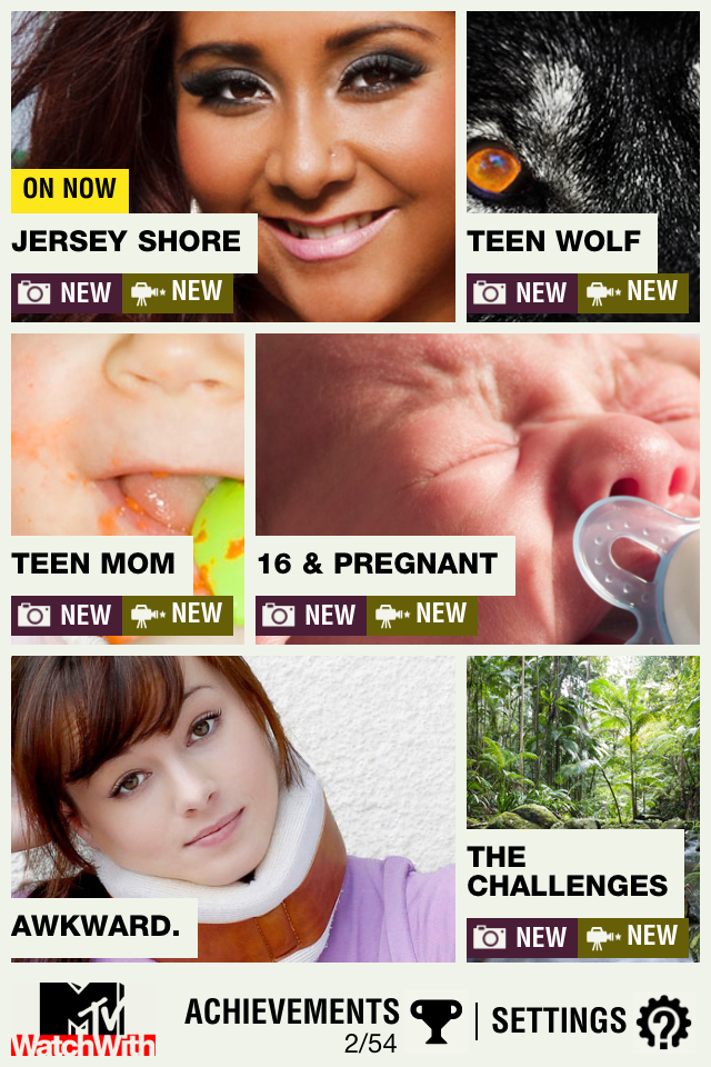
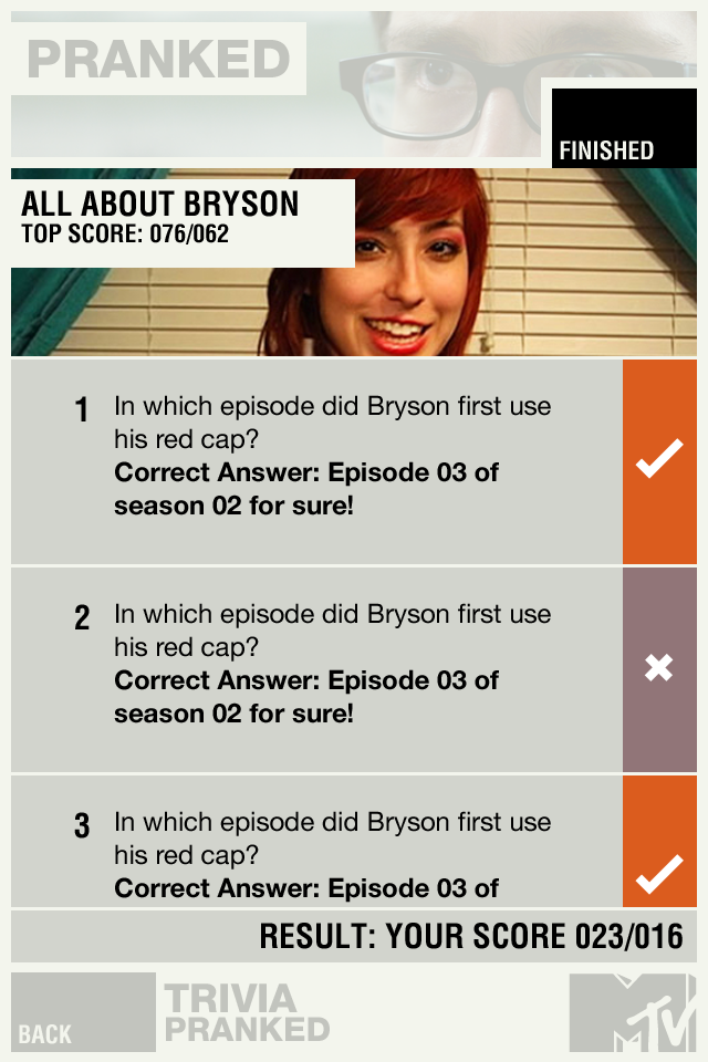
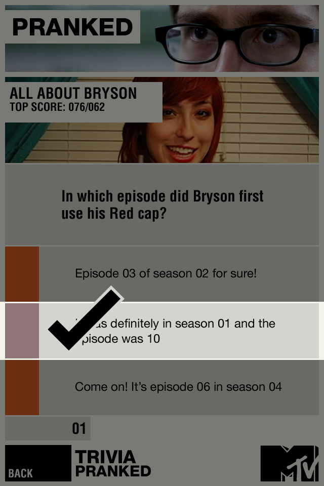
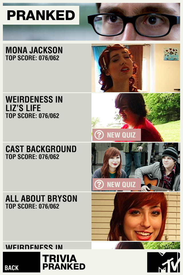
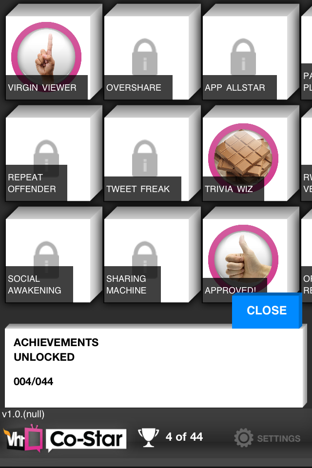
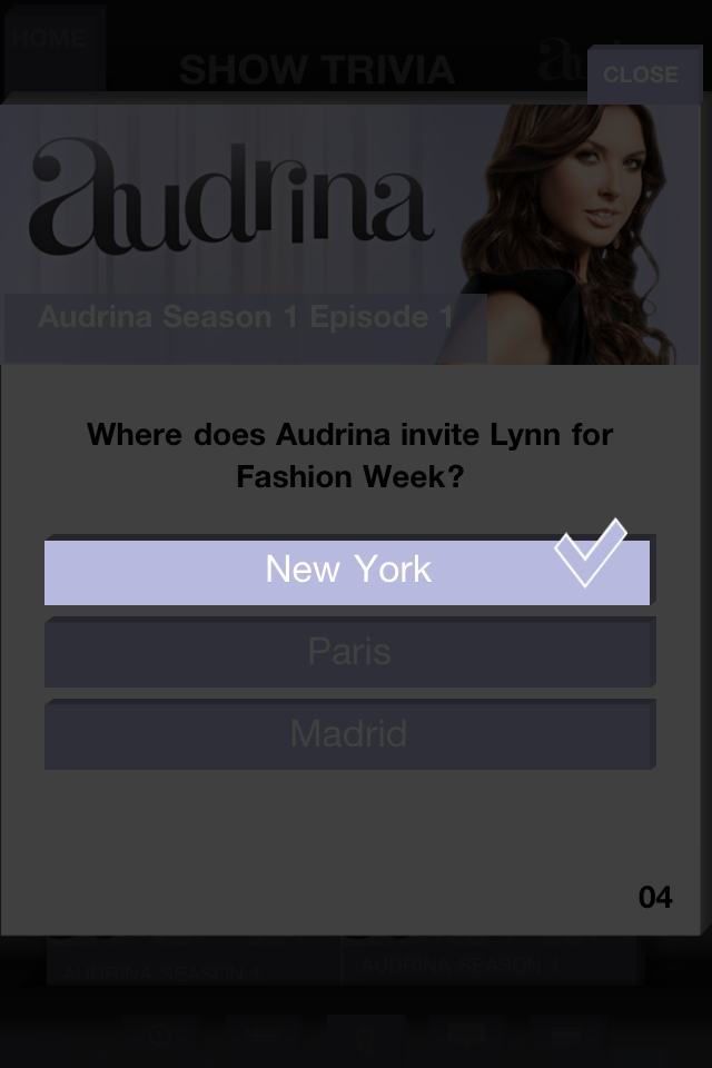
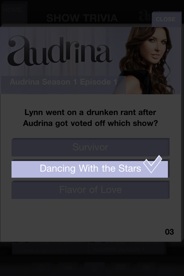
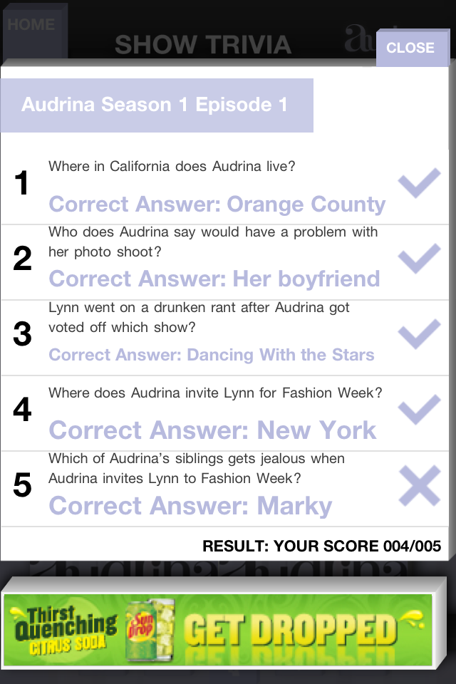
TV Tune-In features a unique gaming platform for earning achievements & adding mini-games, providing trivia. The Achievements API is extremely flexible and has been constructed such that a user can earn the achievements has a list of steps, once completed are provided a reward.
A producer can create mini-games from a series of template games.

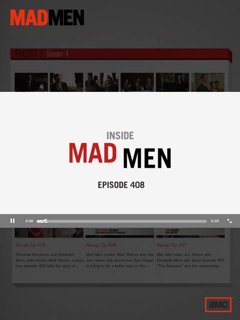
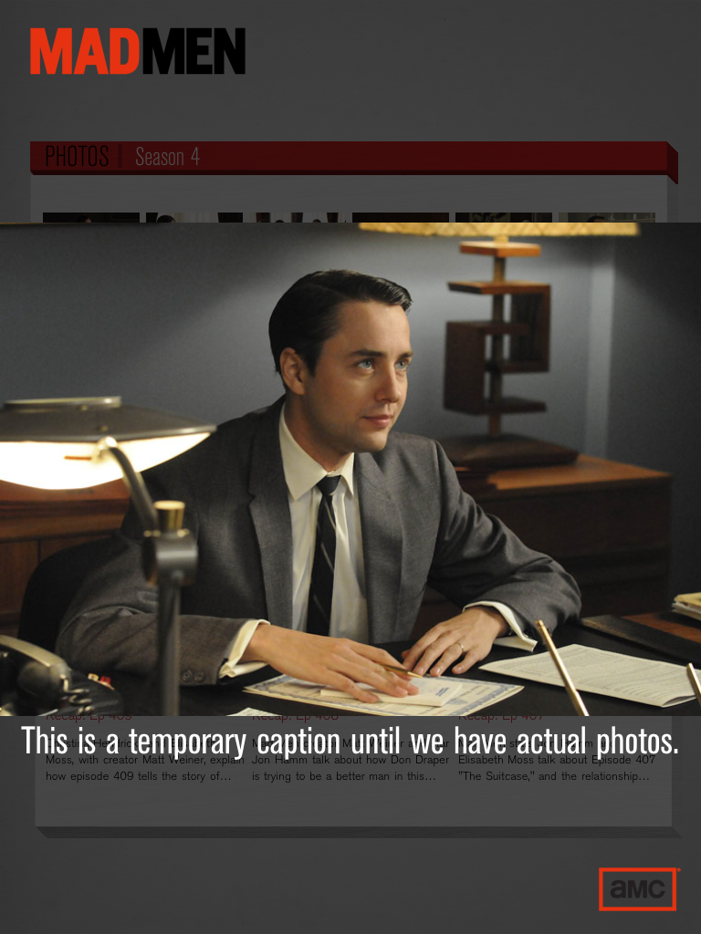
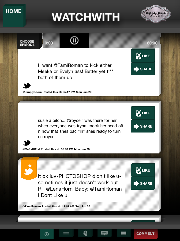
MTV WatchWith
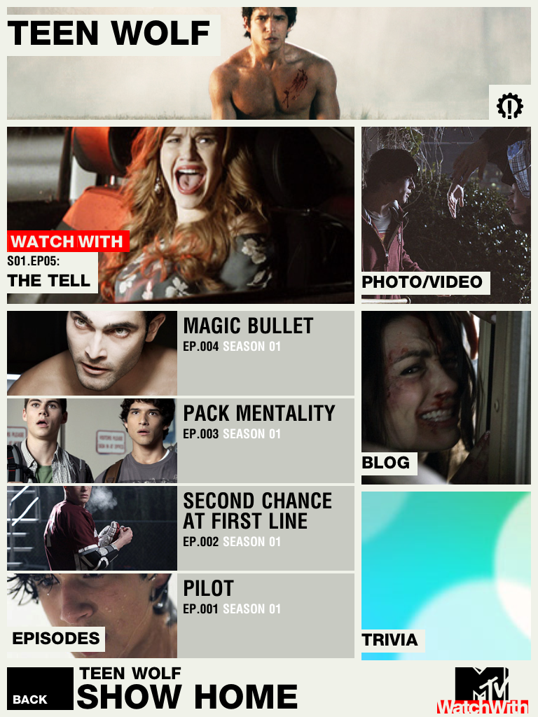
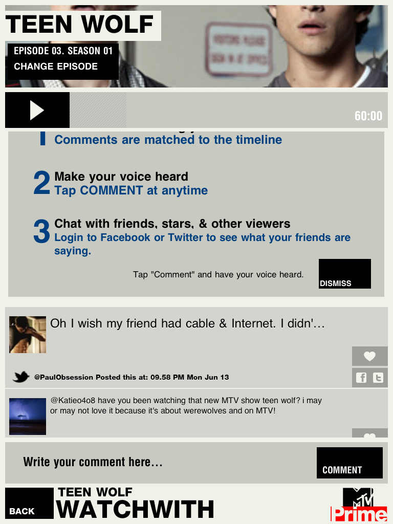
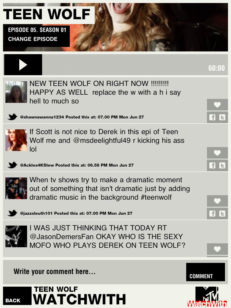
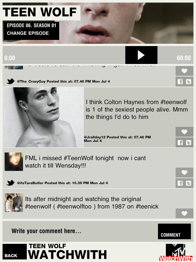
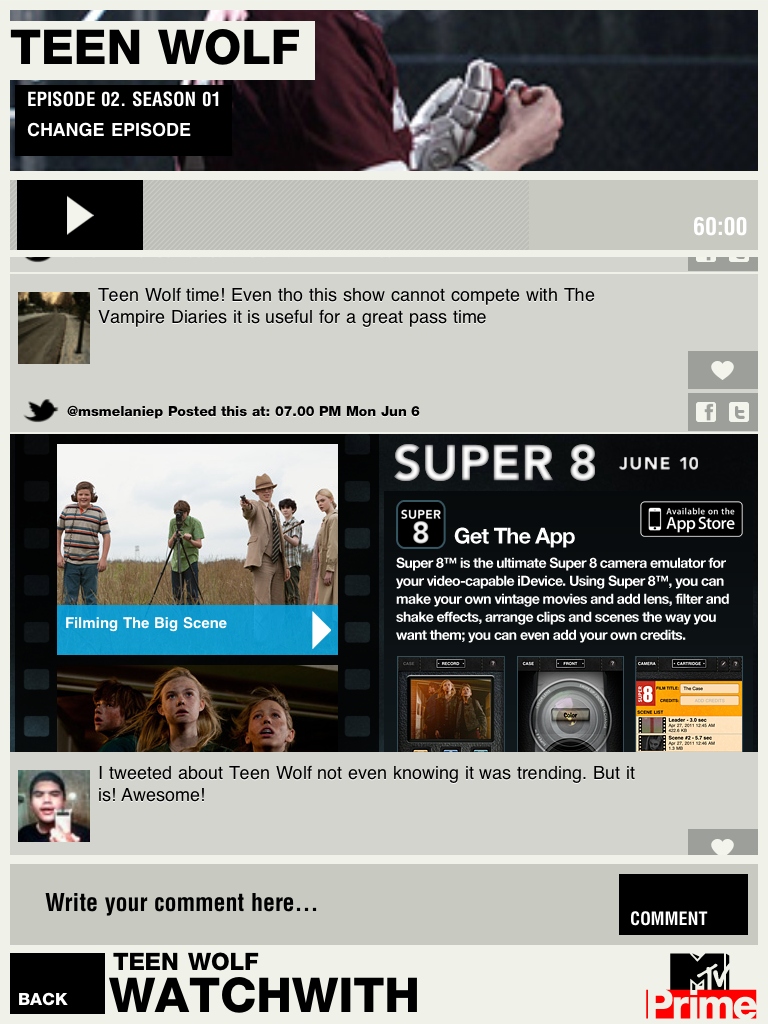
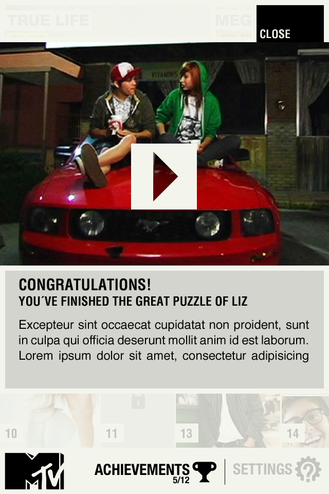
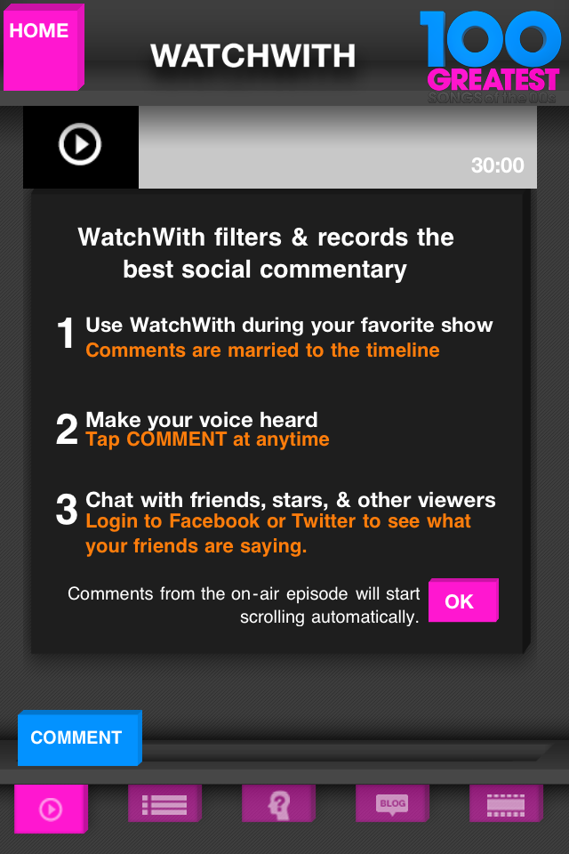
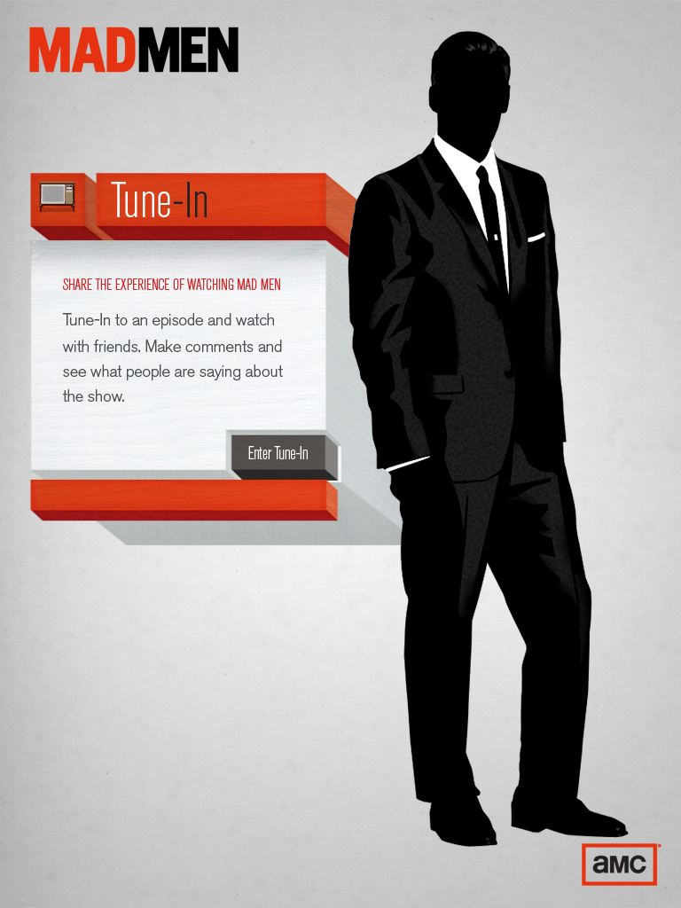
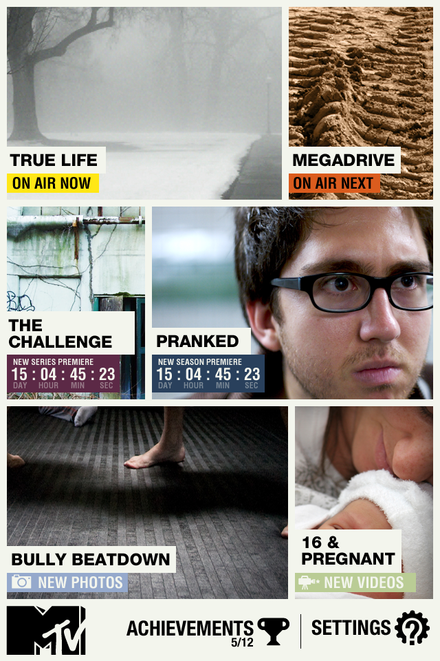
In 2010, we began working with MTV Networks to launch MTV WatchWith, as our first network partner. Considered the DVR for Conversations, MTV championed an aggressive push to capture the second screen experience. It earned the Best Second Screen Television App at AdAge Vanguard Awards in 2011.
CONCEPT DESIGN GOALS
01
Brand Coherence
Keep inline with the brand where it ́s shown has been a guiding factor. The material received for the on air graphics as well as the recently redesigned online presence has been the main inspiration.
02
Usability / User Experience
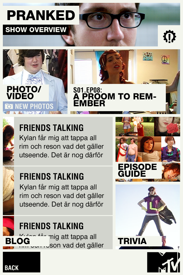
The design should convey the brand and at the same time have good usability. The UI needs to be visually strong and create a varied experience to the user not only the first time of use but the user should feel an urge to return to the app due to the updates, additional content and the dynamic varied way in which these updates are experienced.
03
Low Maintenance
The application should take very little effort to update. The use of movies as transitions should be avoided and all transitions should be kept in code to allow for maximum flexibility. Also, additional content should be easily added and ideally the application UI design should expand accordingly automatically.
04
Easy to evolve
As the application is being scaled from iPad to lower end iPhone we need to make sure that each version is making good use of the devices it ́s running on. We need to be able to scale down the iPad version and create a good iPhone version.
CONCEPT DESIGN
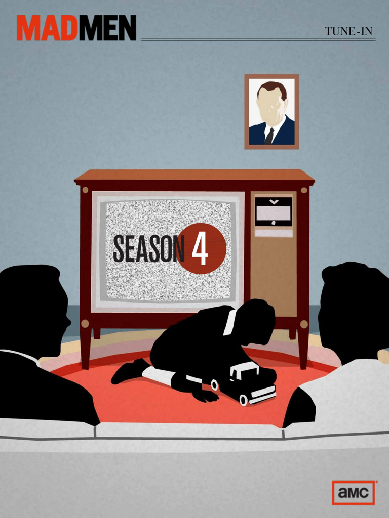
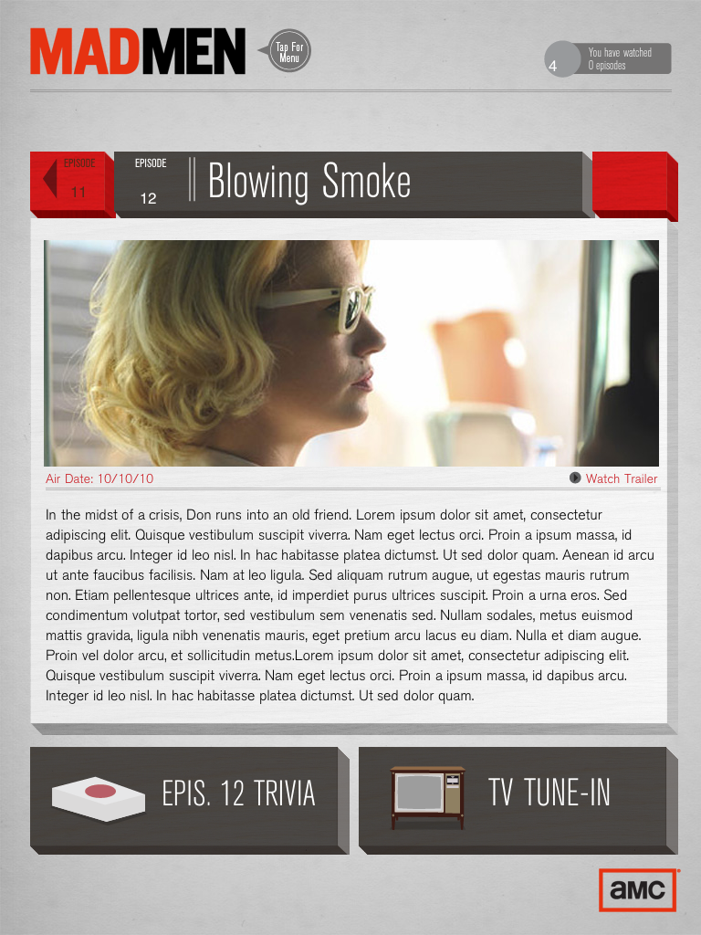
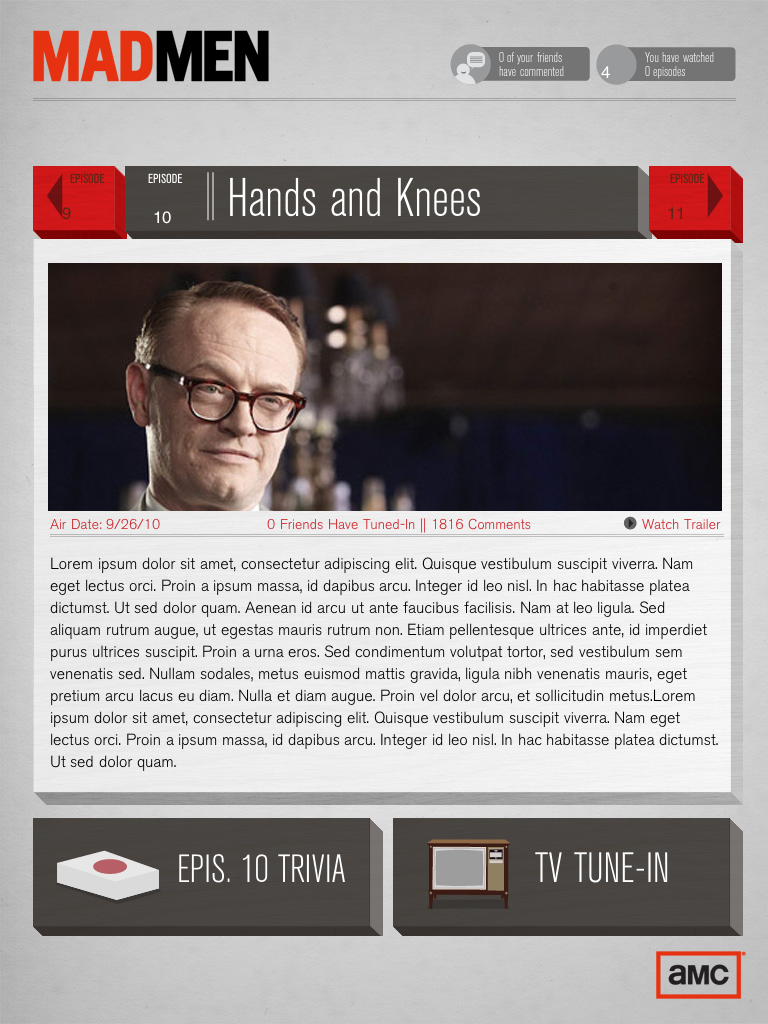
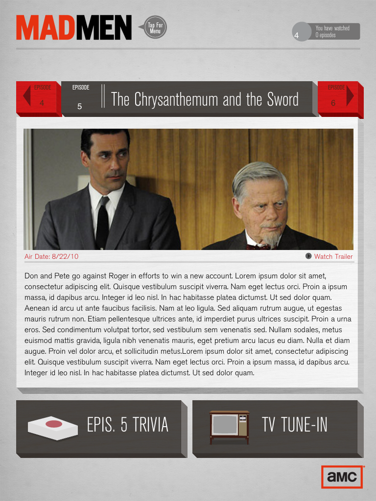
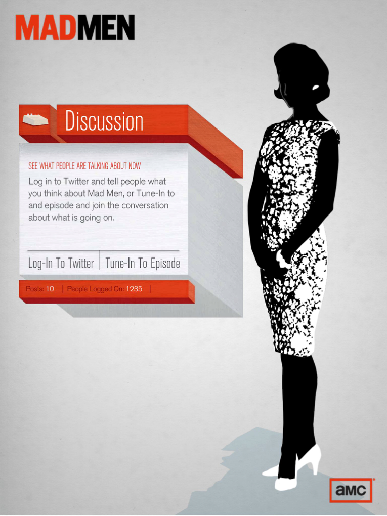
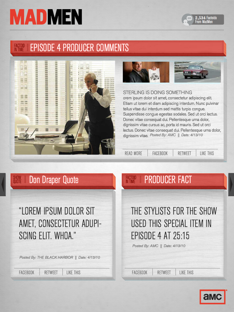
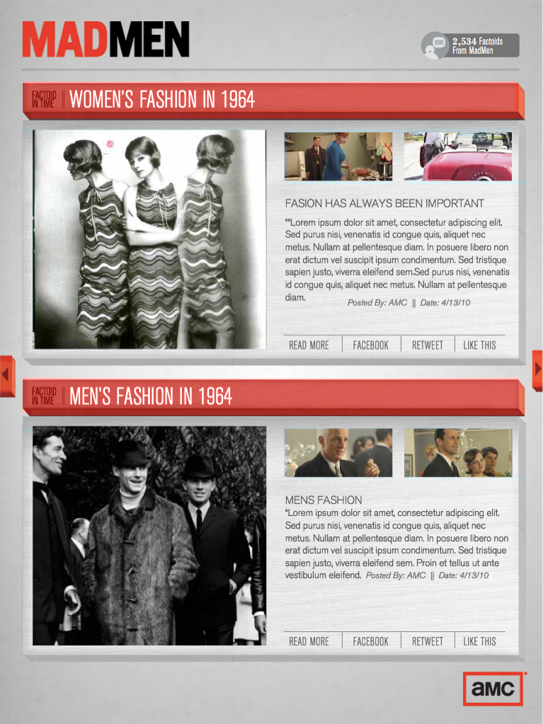
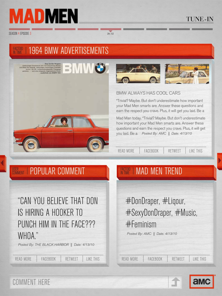
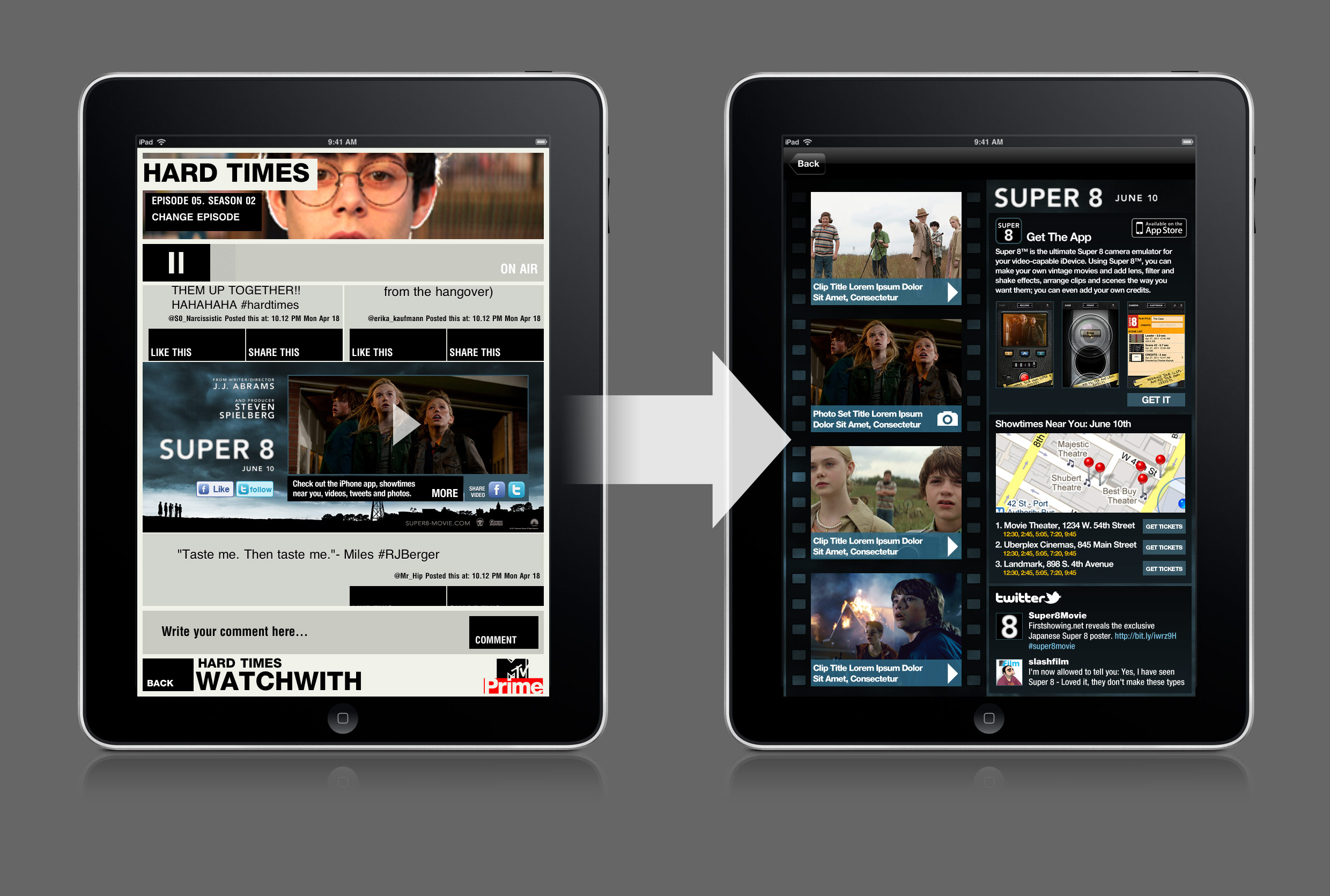
We presented two stylistically similar directions that followed their on-air branding. One was inspired by a comic book series, the other by retro MTV art. What follows is a small sampling of an overall presentation to executives exploring the concepts and interaction design.


INTERACTION DESIGN


screenshots & Transitions
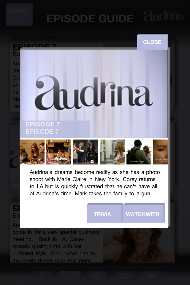
Vh1 Co-Star
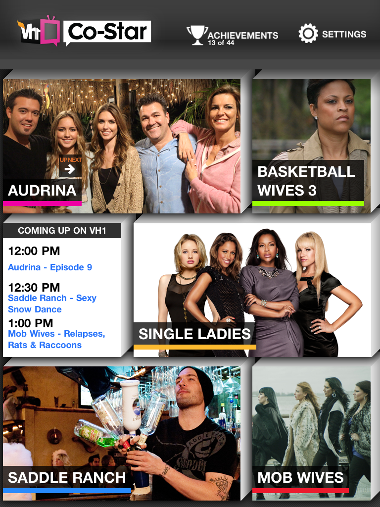
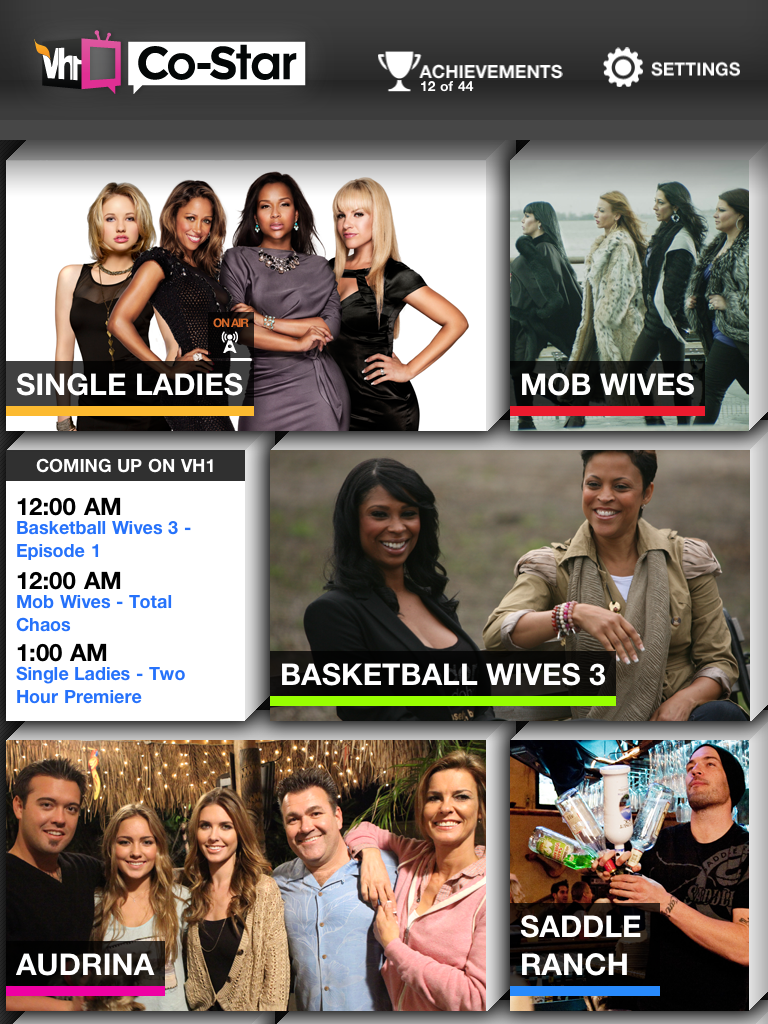
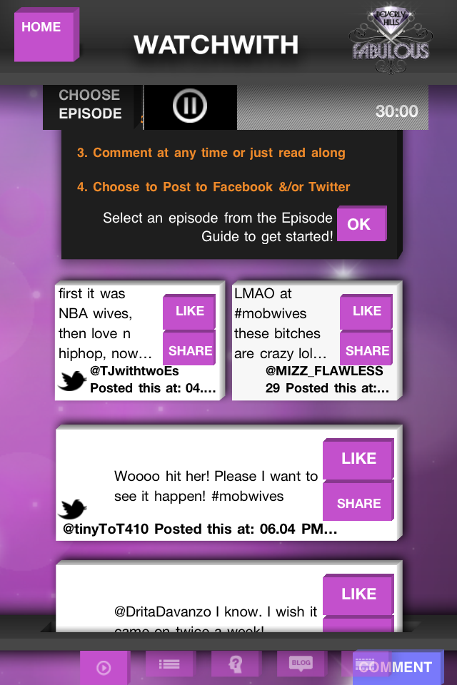
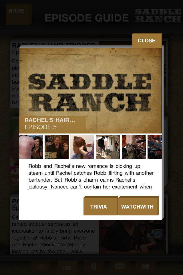
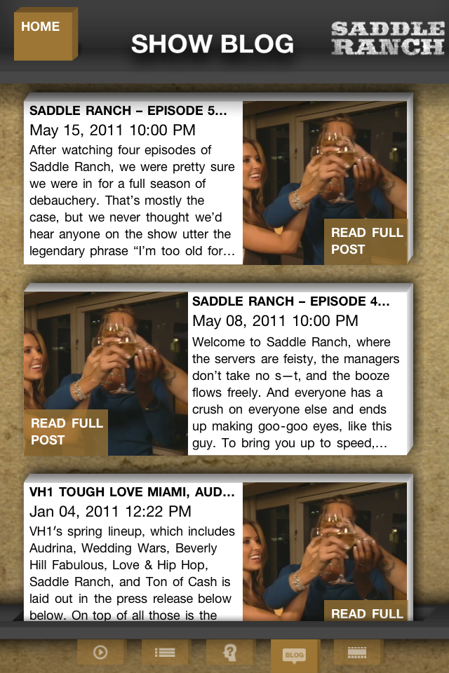
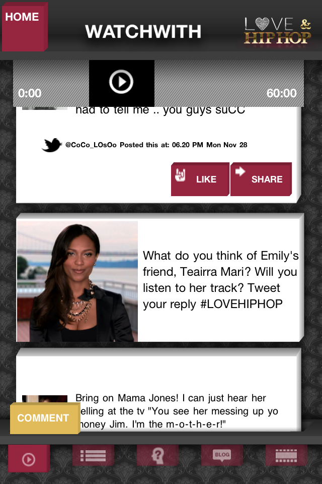
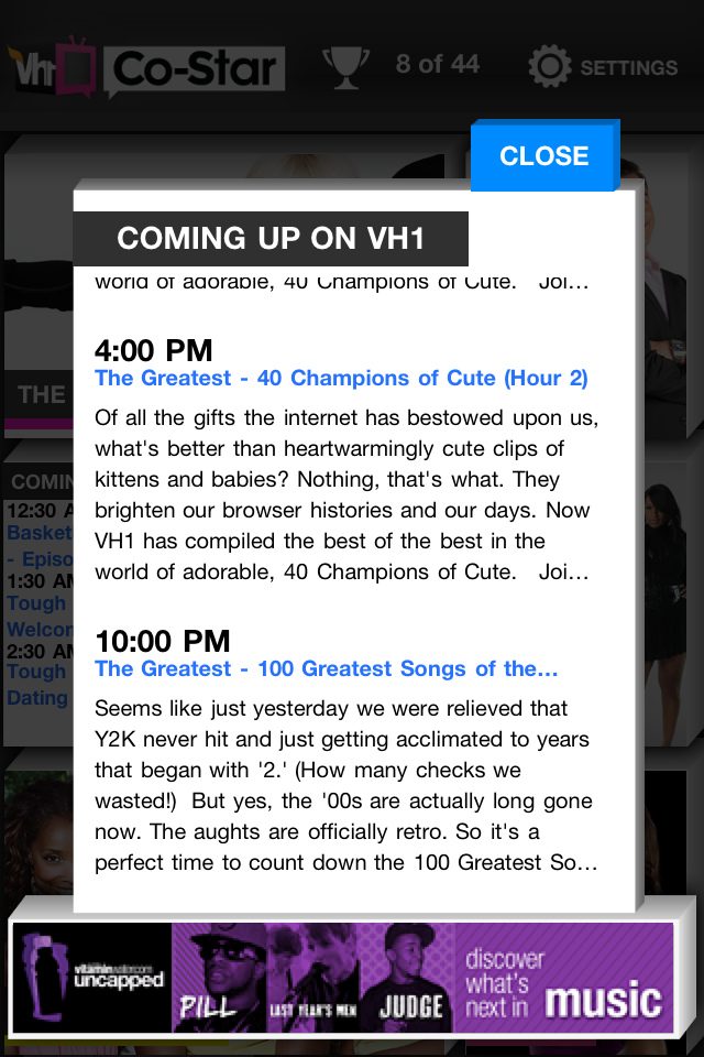
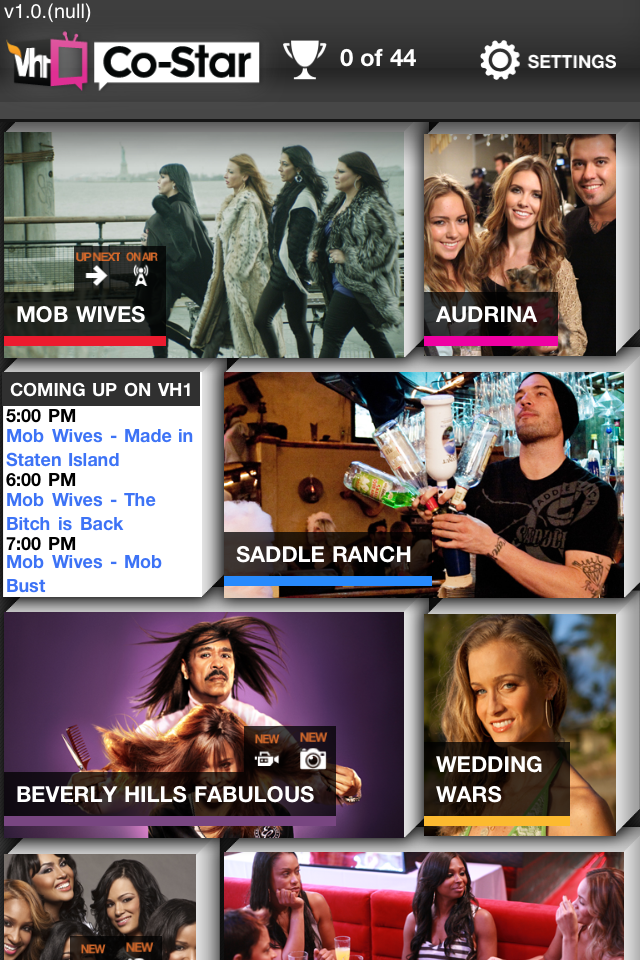
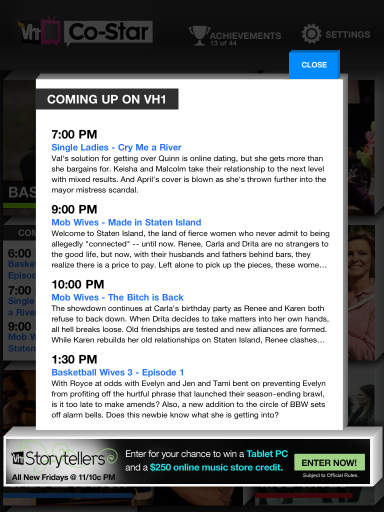
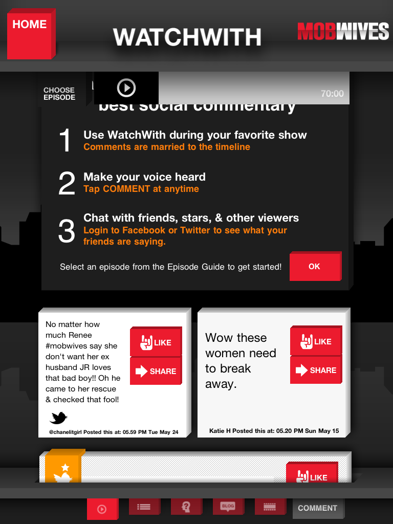
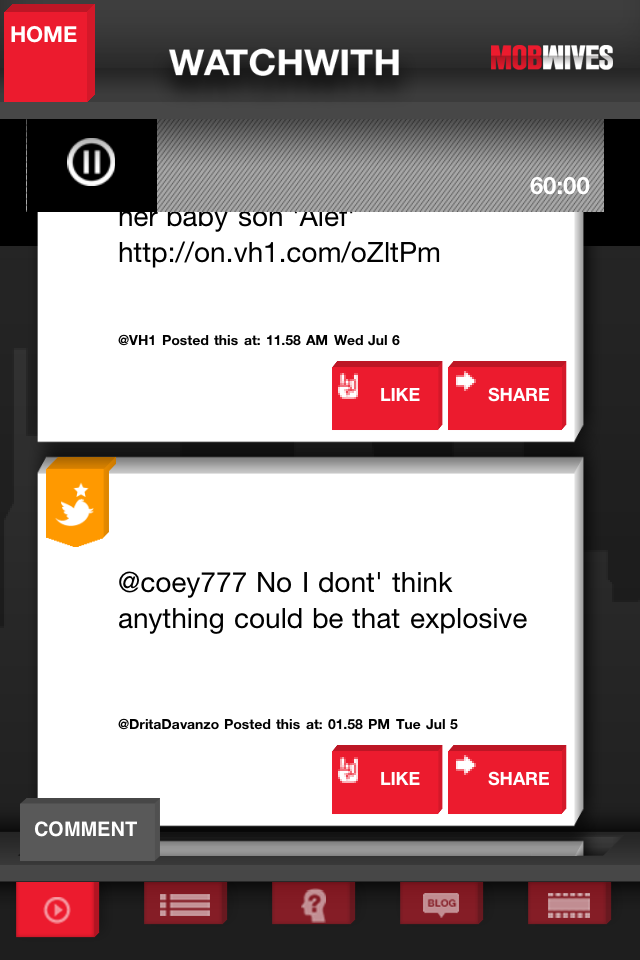
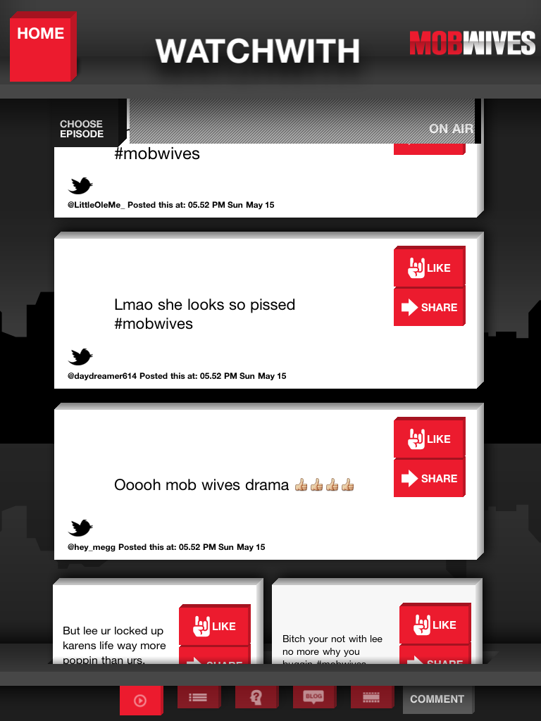
Vh1, a sister channel on MTV Networks, had incredible numbers in social. With hit shows – like Basketball Wives, Mob Wives, Celebrity Rehab, and Love & Hip Hop – Vh1 had an actively engaged audience. Adding another channel from MTV Networks was simple when using our flexible front-end framework.
CONCEPT DESIGN
01
Brand Coherence
Keeping in line with the VH1 TV and online branding, the 3D cubic shape was prominent within the branding and offered. The layout would be similar to the MTV branded show but with a unique VH1 feel. The style mixes well with the classic pixel art designs which allows for dimension on a digital screen.

02
Lightweight Cube Animations
Continuing the concept into transitions and throughout the app through lightweight html cube transitions, bringing continuity. With very little additional effort, the cube effect could transcend the Co-Star design. Each show would use the cast or key moments imagery, and a basic color theme through the show assets but when set together at the network home, the brands would feel consistent.
03
Maintaining Unique Show Branding
The cube concept allows the individual and varied show branding to appear consistent across a number of different shows.

INTERACTION DESIGN


Duke Gametime
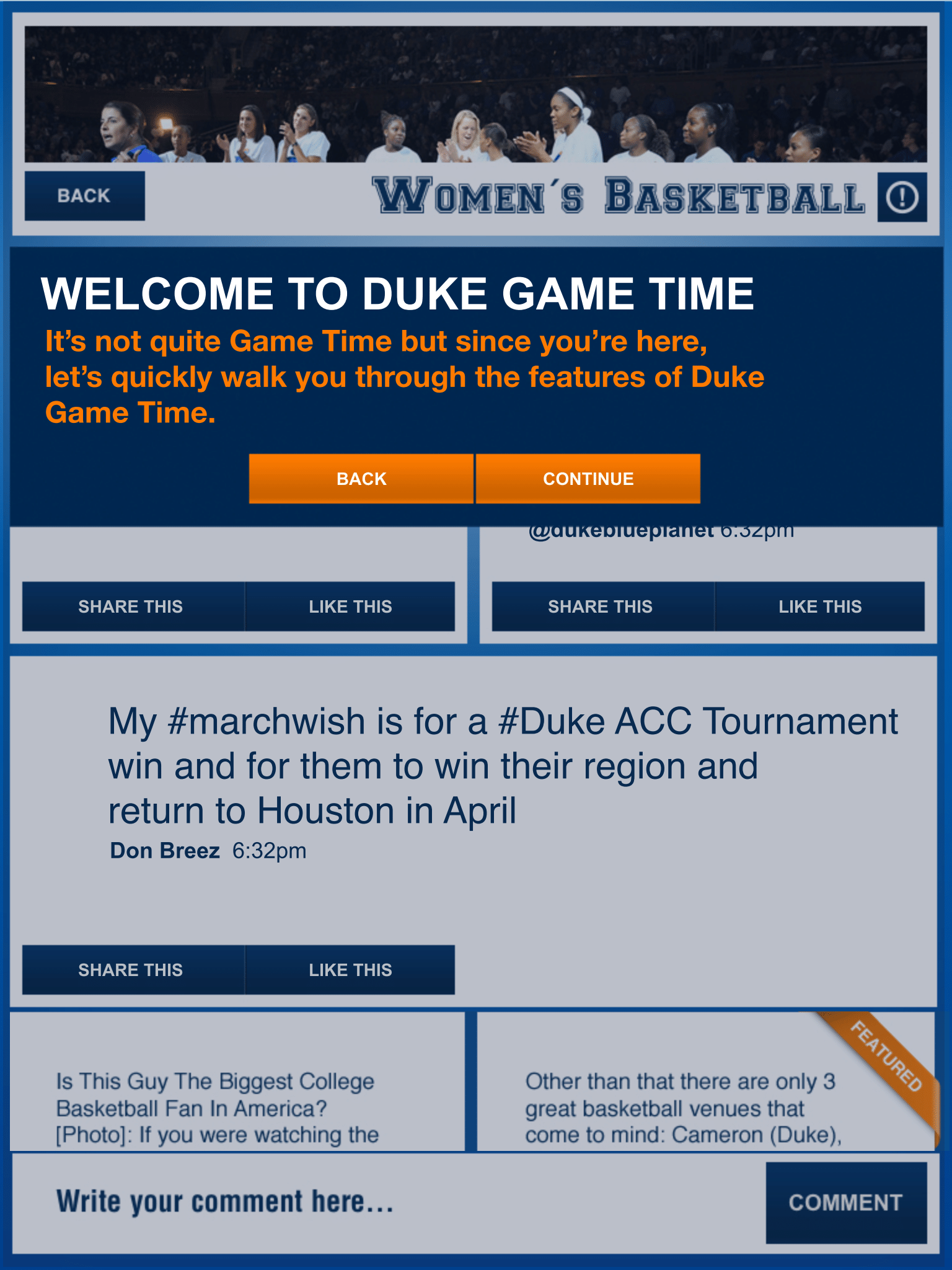
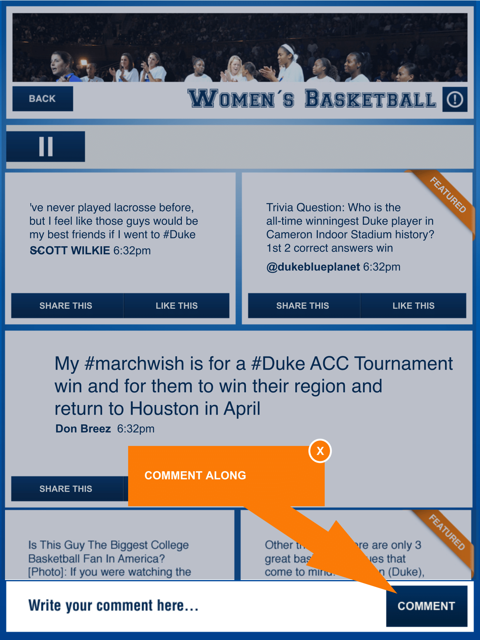
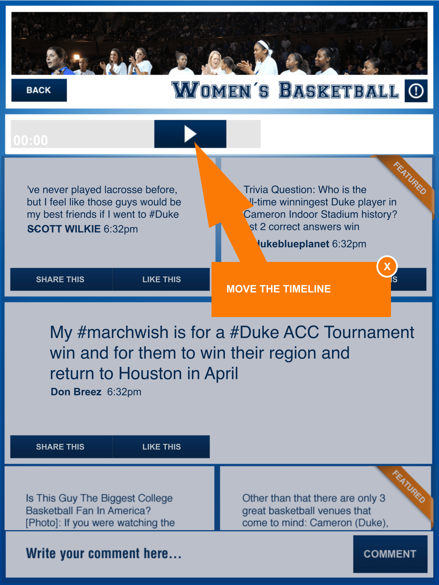
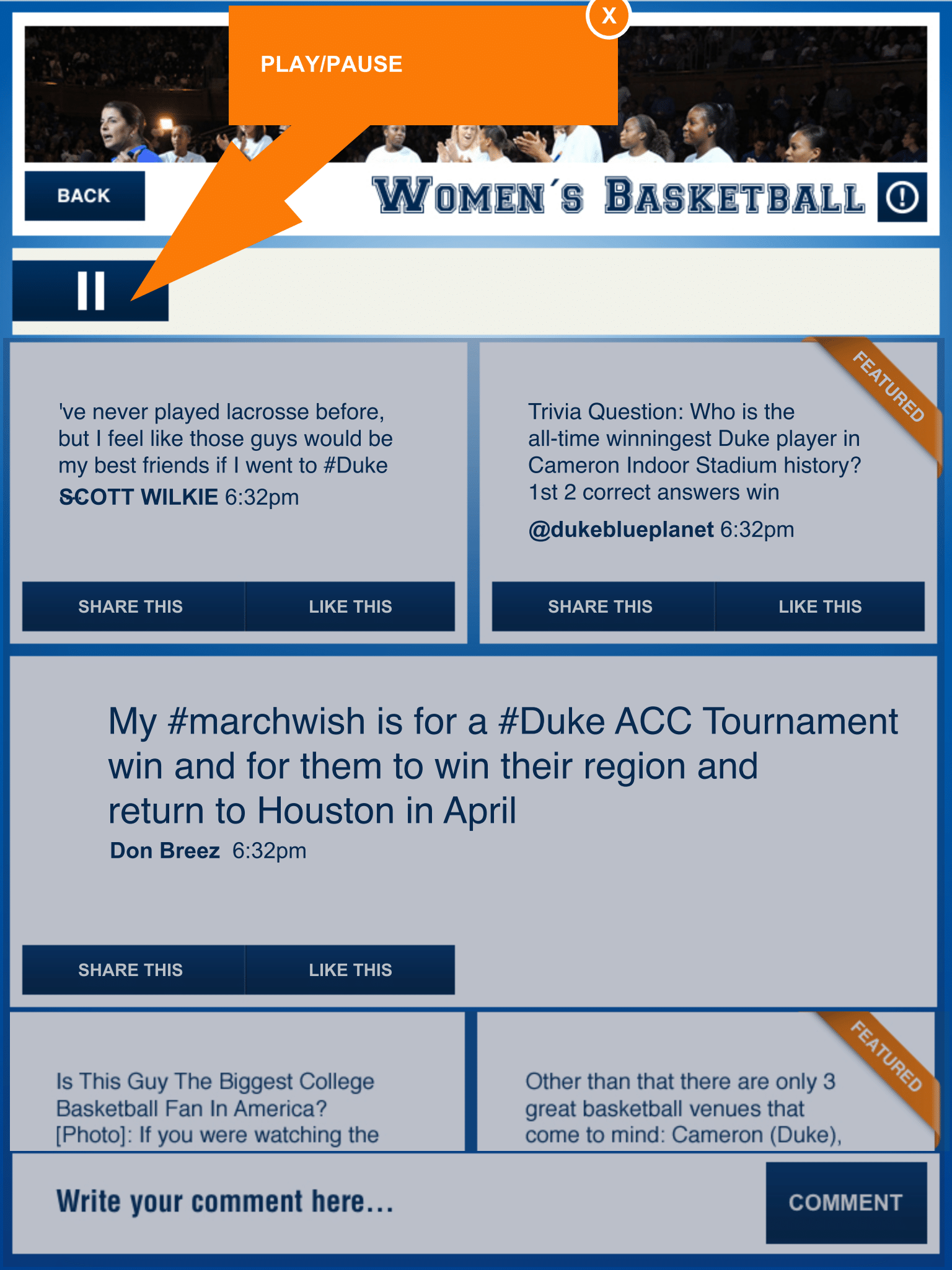
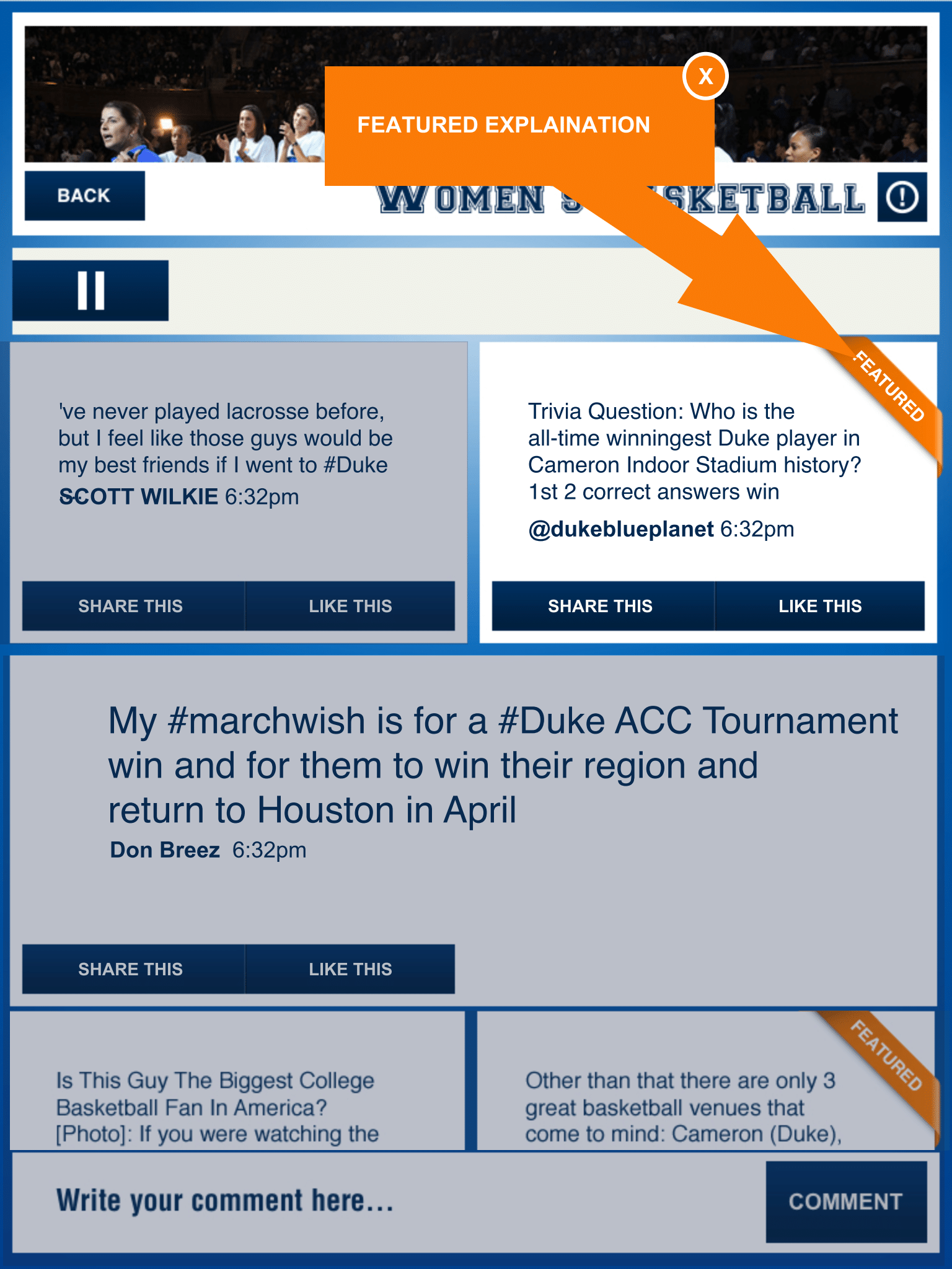
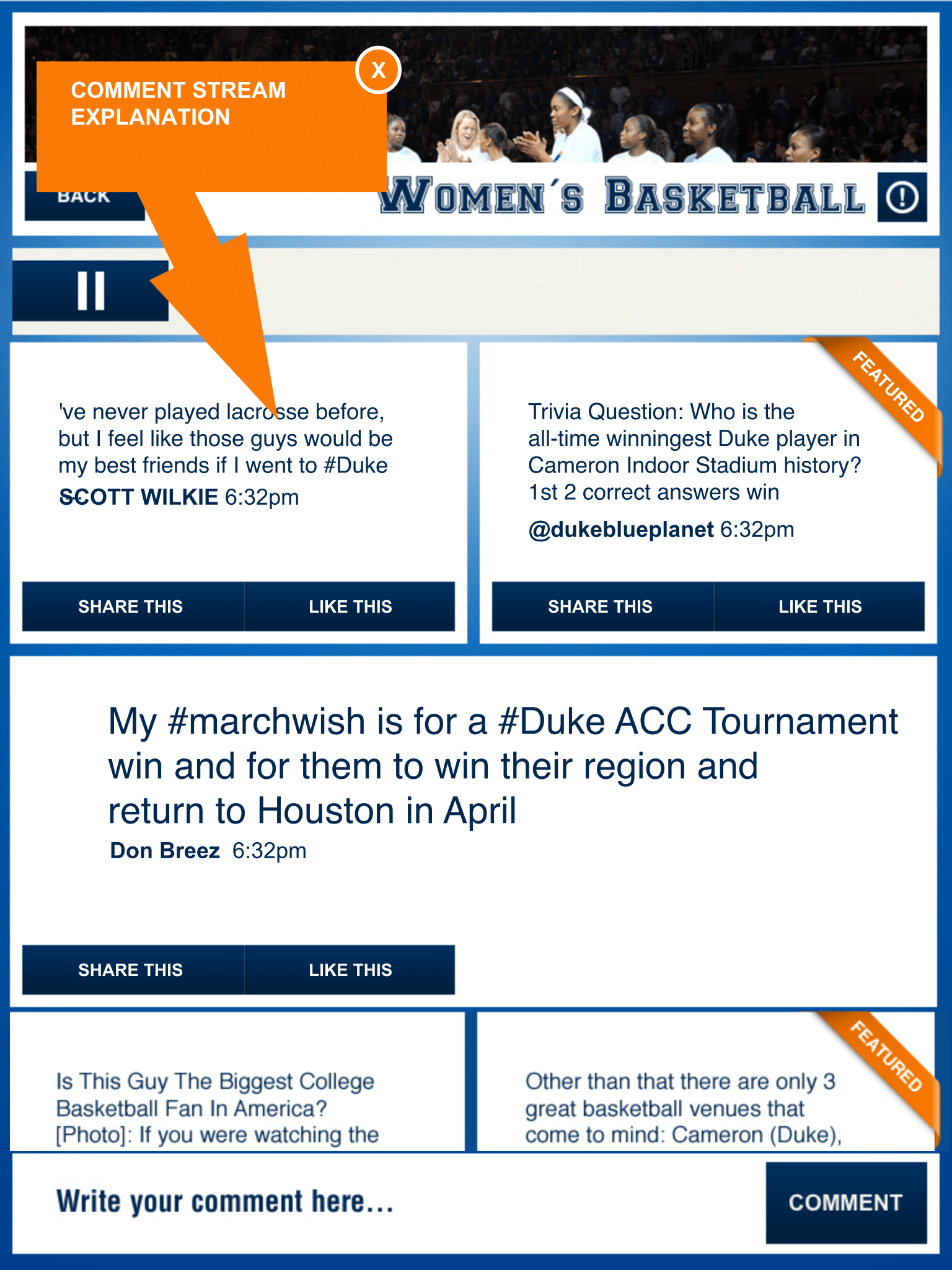
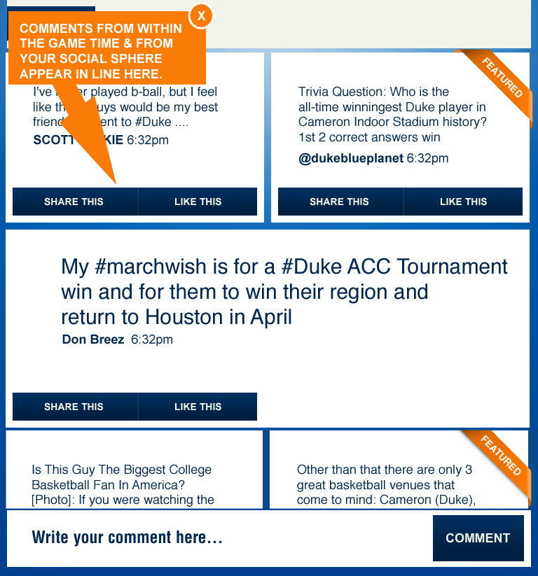
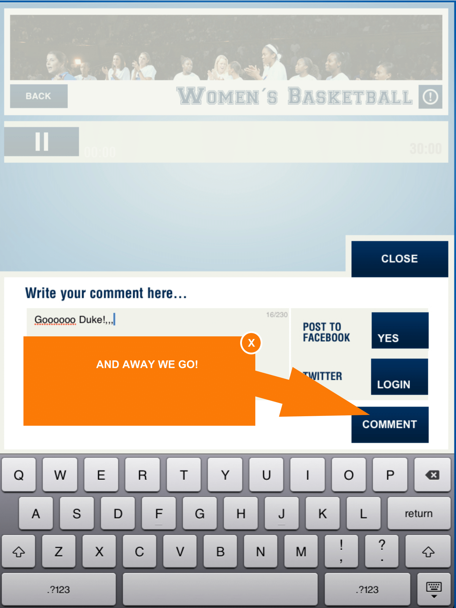
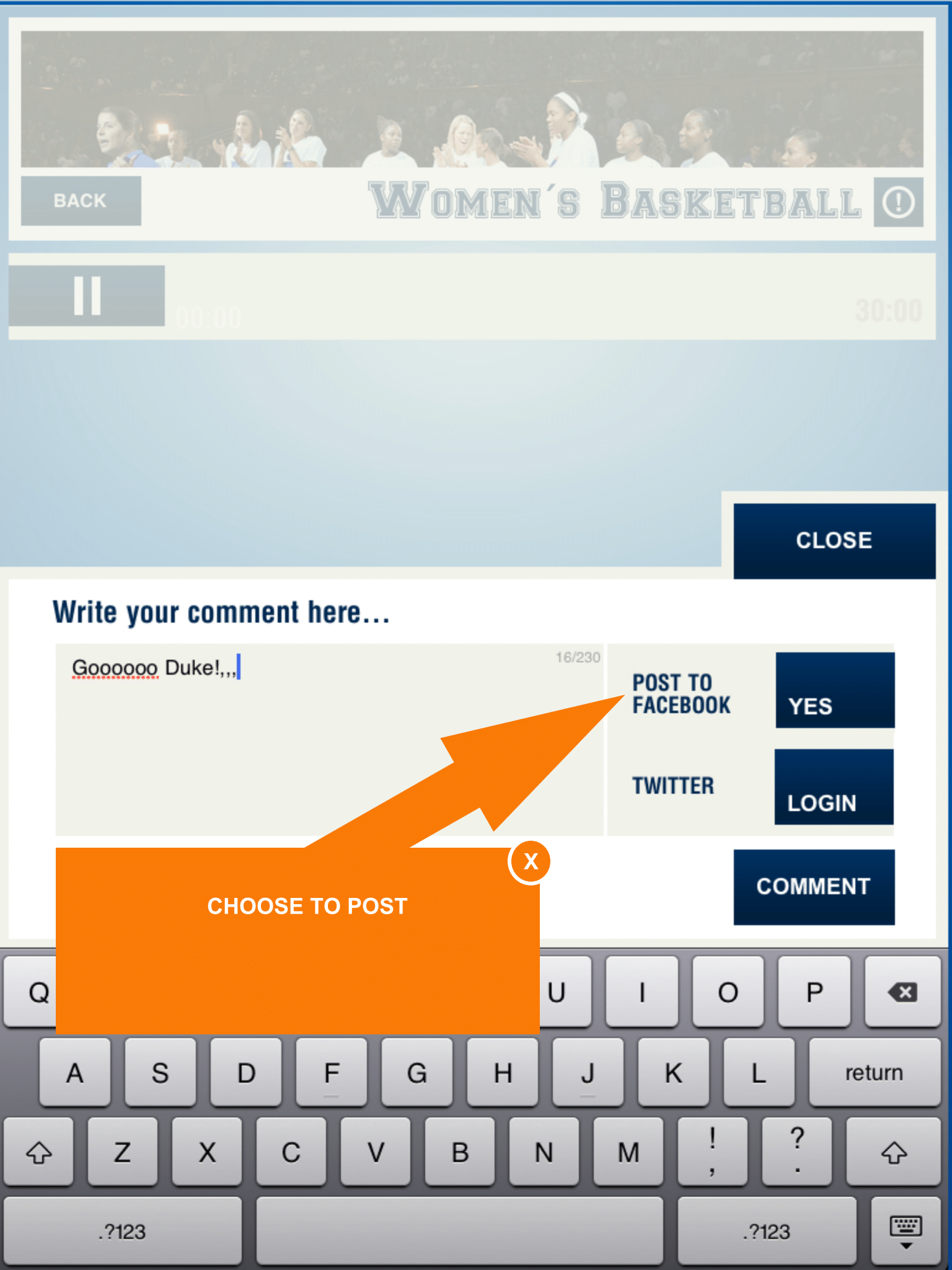
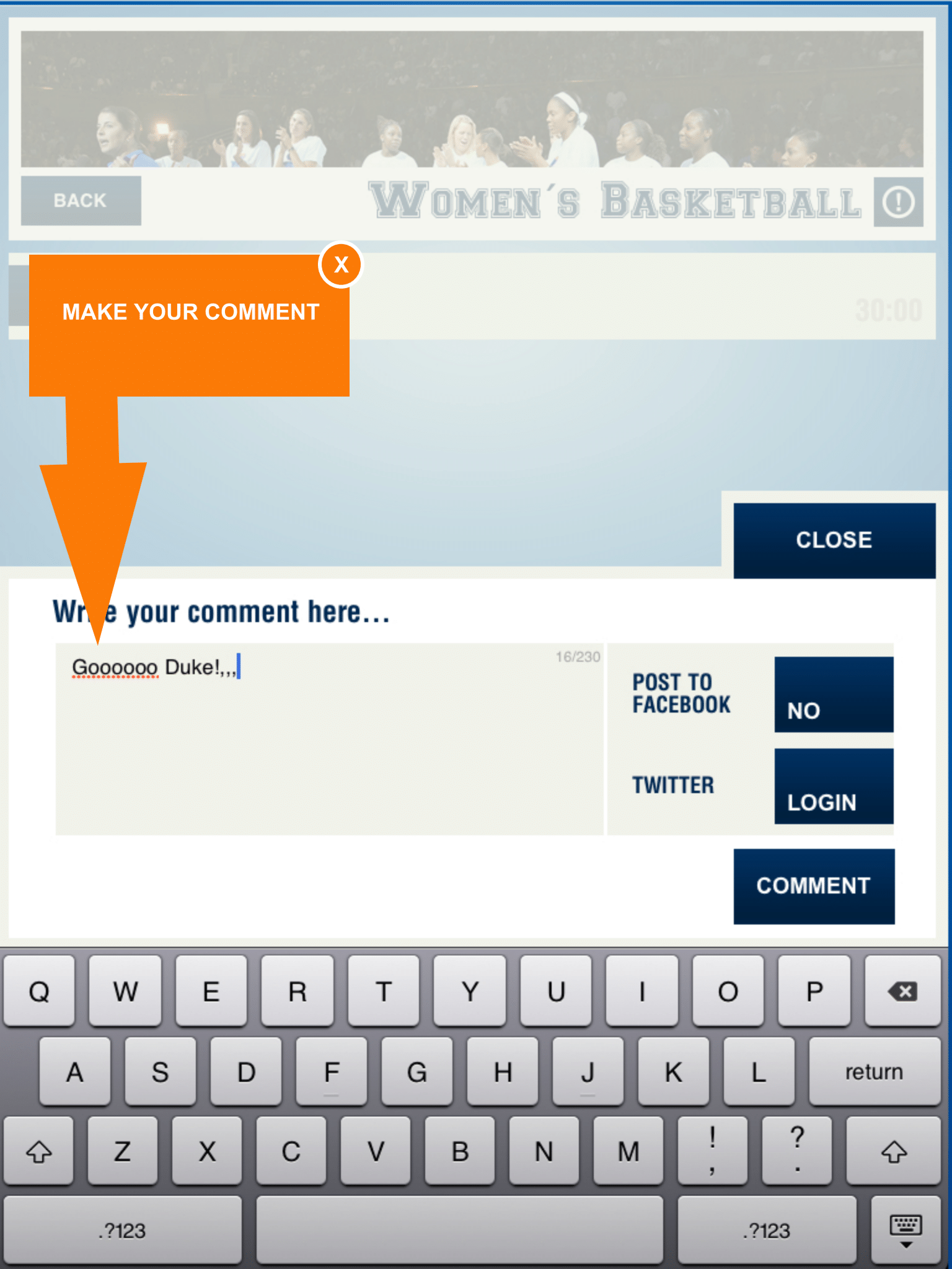
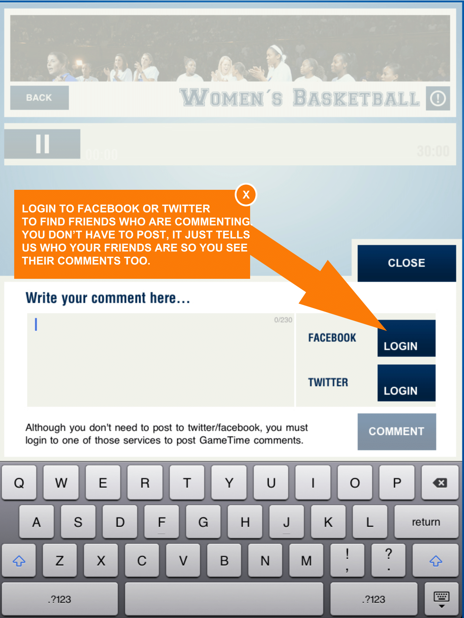
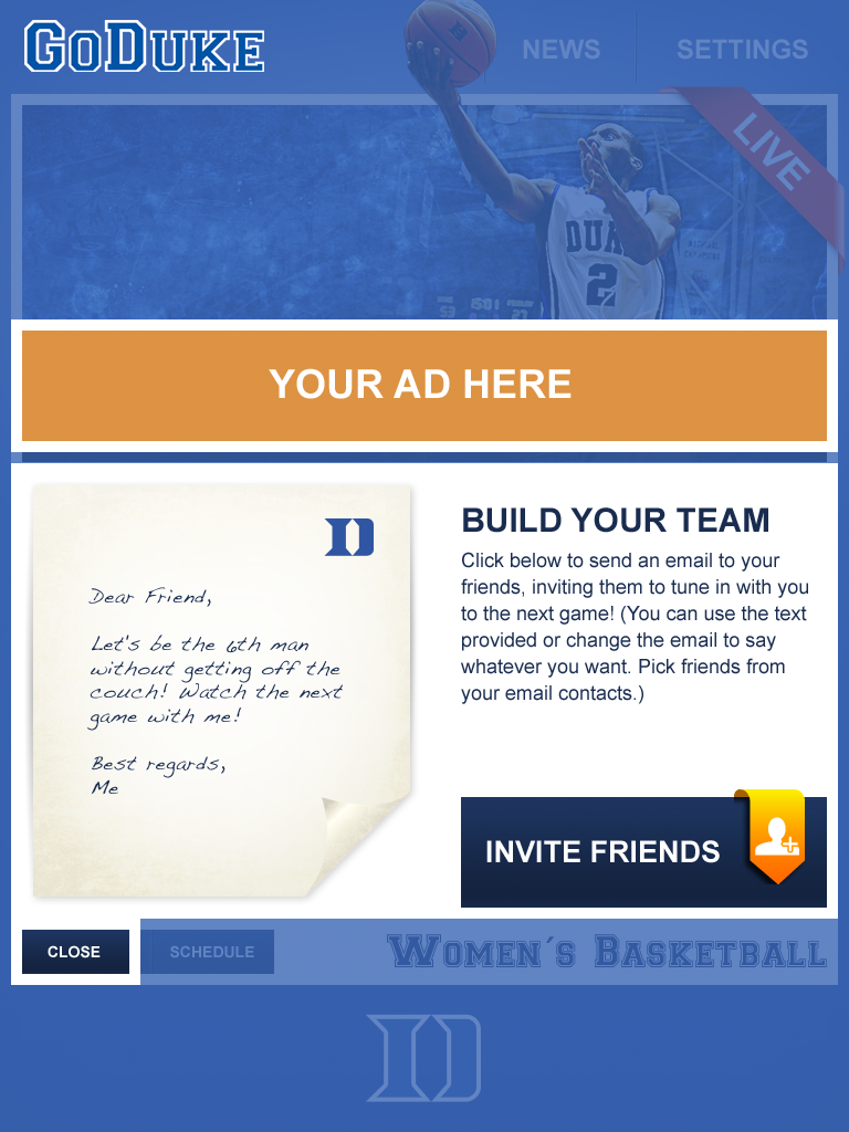
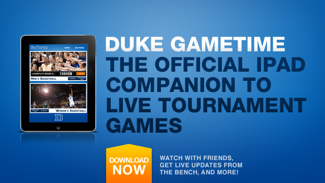
My co-founder was a graduate of Duke University. Her alumni status offered us access to exclusive content and a built in serious fan community for testing our first live sports instance for college basketball. Duke Gametime was a Final Four NCAA Duke Basketball fan app that allowed us to test moderation in live voice commentary, small group chat, exclusive content, and to observe how fans of basketball come together around live events.
PROMOTION

SIMPLE INTERACTION DESIGN


